What is the 10/20/30 Rule for Pitch Decks?

Imagine you’re standing in front of a group of potential investors, the kind of people who could turn your dream business into a reality. Your heart is pounding, your palms are a little sweaty, and you know you have just a few precious minutes to convince them that your idea is worth their money. What do you do? How do you make sure your message is clear, compelling, and memorable, even under pressure? This is where understanding 10/20/30 rule can make all the difference.

This is where the legendary “10/20/30 Rule” for pitch decks comes into play. It’s a simple, yet incredibly powerful guideline developed by venture capitalist and entrepreneur Guy Kawasaki. It’s designed to help you create a pitch that’s not only effective but also respects the valuable time of your audience. As someone who has seen countless pitches and helped many founders refine their stories, I can tell you that following this rule can significantly increase your chances of success. Let’s dive in and explore how this rule can transform your next presentation.

Key Takeaways

  • 10 Slides: Keep your pitch deck to a maximum of 10 slides, focusing only on the most crucial information to maintain investor interest.
  • 20 Minutes: Aim to deliver your entire presentation within 20 minutes, leaving ample time for questions and discussion.
  • 30 Point Font: Use a minimum font size of 30 points to ensure readability and force you to be concise with your text.
  • Clarity is King: The rule promotes clarity, conciseness, and professionalism, making your pitch easier to understand and remember.
  • Practice Makes Perfect: Adhering to the rule requires significant preparation and practice to distill your message effectively.

What is the 10/20/30 Rule Anyway?

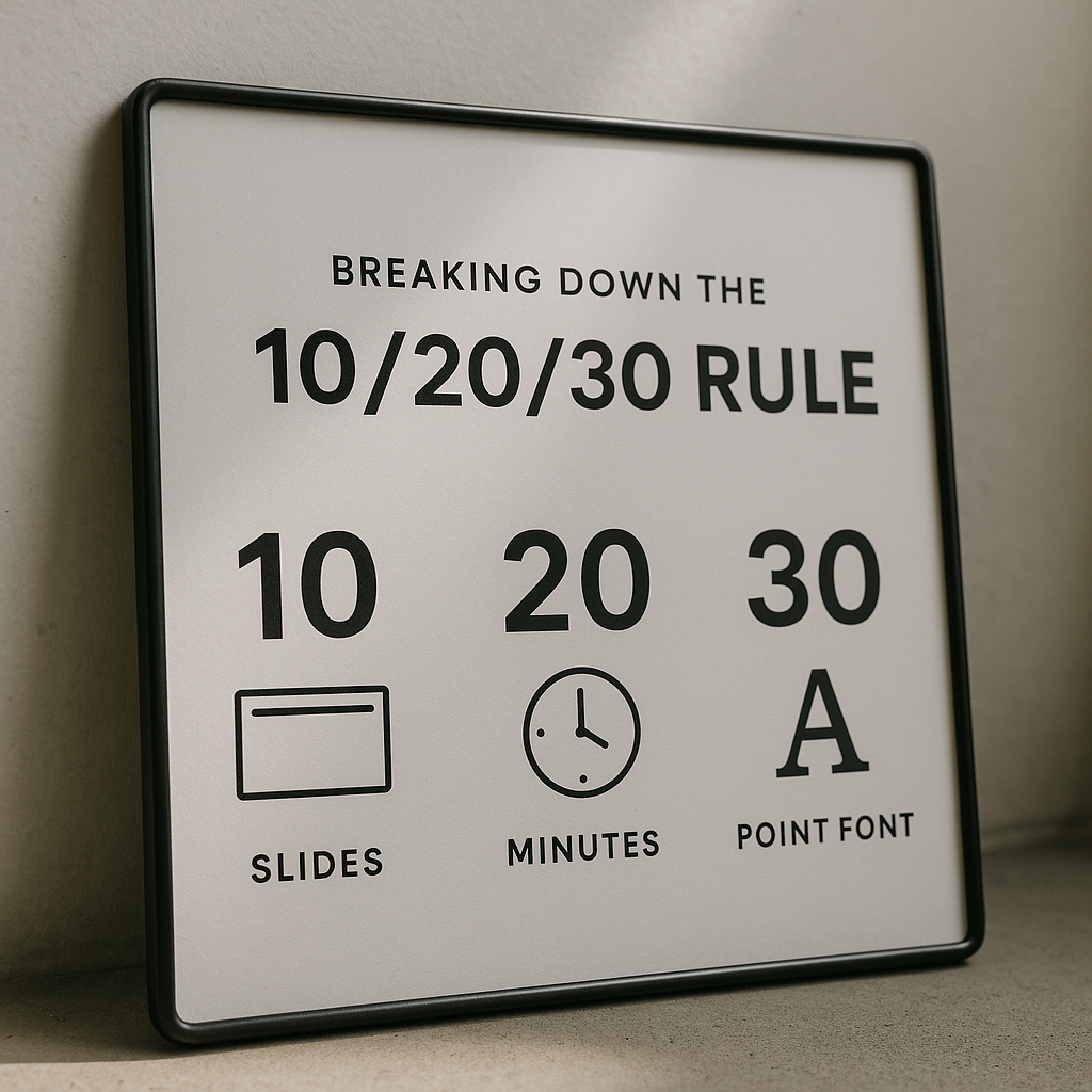
The 10/20/30 Rule is a guiding principle for creating and delivering effective presentations, especially pitch decks aimed at investors. It was popularized by Guy Kawasaki, a renowned venture capitalist, author, and entrepreneur, who observed that many entrepreneurs fail to deliver compelling pitches because their decks are too long, too detailed, or too hard to read.

Kawasaki’s wisdom is simple: your pitch presentation should have:

  • 10 Slides: No more, no less. This forces you to be incredibly concise and focus on only the most vital information, ideally limiting the number of slides to ten to explain your concepts clearly.
  • 20 Minutes: The total time you should spend presenting your slides, allowing at least 40 minutes for discussion and questions in a typical one-hour meeting. This is crucial to make your presentation effective and engaging.
  • 30 Point Font: The smallest font size you should use in your presentation, ensuring that no font smaller than thirty points is used. This guarantees readability for everyone in the room and prevents you from cramming too much text onto a slide.

“When you’re trying to get someone to invest in your dream, clarity is your best friend.”

I’ve seen firsthand how often founders fall into the trap of trying to tell their entire life story in one sitting. But investors are busy people. They need to quickly grasp your vision, your problem, your solution, and why you are the right team to execute it. The 10/20/30 Rule helps you do just that. It’s not just a set of numbers; it’s a philosophy that champions brevity, impact, and respect for your audience’s time. In a winning pitch deck, limiting the number of slides while ensuring your presentation design is clean and simple is key. A great presentation often adheres to the rule for slideshows that Guy Kawasaki advocates.

Breaking Down the 10/20/30 Rule

Let’s dissect each component of this powerful rule and understand the genius behind it.

1. 10 Slides: The Power of Brevity

Why exactly 10 slides? Because, as Kawasaki puts it, “a normal human being cannot comprehend more than ten concepts in a meeting.” Our attention spans are short, and investors hear many pitches. Your goal isn’t to dump all your information on them; it’s to spark their interest enough to want a second meeting.

So, what should these 10 crucial slides cover? While there can be slight variations depending on your specific business, here’s a widely accepted structure that I often recommend to founders:

  1. Title Slide: Your company name, logo, and your name/title. Keep it clean and professional.
  2. Problem: Clearly define the pain point or challenge your target customers face. Make it relatable and impactful.
  3. Solution: How does your product or service solve the problem you just presented? Focus on the core benefit. This is often where you might show a quick demo or visual. Remember, good UI is good business, so if your solution has an interface, make it shine! ✨
  4. Market Opportunity: Who are your customers? How big is the market for your solution? Show that there’s a significant demand.
  5. Product/Service: A deeper dive into what you offer. What are its key features and unique selling points? How does it work?
  6. Business Model: How do you make money? What’s your pricing strategy? This needs to be clear and sustainable.
  7. Competition: Who are your competitors, and what makes your solution superior or different? Don’t shy away from competition; show how you stand out.
  8. Team: Who is behind this venture? Highlight key team members, their relevant experience, and why this team is uniquely qualified to succeed. Investors invest in people as much as ideas.
  9. Financials/Milestones: Your past achievements, key metrics, and a summary of your financial projections (revenue, growth). Show where you’re headed and what you’ve accomplished so far.
  10. The Ask/Call to Action: How much money are you raising, what will you use it for, and what milestones will this funding help you achieve? Be specific and confident. Include your contact information.

“Each slide should tell a vital piece of your story, without overwhelming your audience.”

This structure forces you to prioritize. If something doesn’t fit into one of these core categories, it probably doesn’t belong in your initial pitch. This discipline is essential for avoiding the common reasons why most pitch decks fail.

2. 20 Minutes: Mastering Your Time

The second part of the rule suggests that you should present your 10 slides in no more than 20 minutes. Why 20 minutes, especially when a typical investor meeting might be an hour long?

The reason is simple: you need to leave time for questions. A pitch deck isn’t a monologue; it’s the start of a conversation. Investors will have questions, and the Q&A session is often where the real magic happens. It’s your chance to show your depth of knowledge, address concerns, and build rapport.

Here’s why 20 minutes is perfect:

  • Respect for Time: It acknowledges that investors are busy and have multiple meetings.
  • Engagement: It keeps the presentation moving, preventing boredom and maintaining interest.
  • Room for Dialogue: It ensures that at least 40 minutes of a one-hour meeting are dedicated to a back-and-forth discussion, which is crucial for building trust and understanding.
  • Focus: Knowing you have limited time forces you to be incredibly focused on your delivery. You can’t waffle or read directly from your slides.

I always advise founders to practice their pitch until they can deliver it smoothly within this timeframe. It’s not about rushing; it’s about being concise and articulate. Your pitch is a conversation starter, not a monologue.

3. 30 Point Font: The Clarity Catalyst

This might seem like a small detail, but it’s incredibly important. Guy Kawasaki insists on a minimum font size of 30 points. Why?

  • Readability: It ensures that everyone in the room, even those at the back or with less-than-perfect eyesight, can easily read your slides. Imagine squinting to read tiny text – it’s distracting and unprofessional.
  • Forces Conciseness: This is the real genius of the 30-point font rule. If you can only fit a few words on a slide, you are forced to choose those words very carefully. It prevents you from writing dense paragraphs and encourages you to use bullet points, key phrases, and powerful visuals.
  • Promotes Speaking: If your slides are sparse, you can’t just read them. This pushes you to talk about the information, elaborate on key points, and engage your audience directly. Your slides become visual aids, not teleprompters.

“If you can’t say it big, you’re saying too much.”

I’ve seen many pitch decks fail simply because they were crammed with text. It’s overwhelming, hard to follow, and signals that the presenter hasn’t distilled their message effectively. Embrace the large font; it’s your friend in the quest for clarity.

Why the 10/20/30 Rule is Your Secret Weapon

Adopting the 10/20/30 Rule isn’t just about following instructions; it’s about gaining a significant advantage in the competitive world of fundraising. Here’s why I believe it’s such a powerful tool:

  • It Forces Clarity and Focus: The most profound benefit is the discipline it imposes. You have to distil your complex idea into its absolute essence. This clarity benefits not just your audience but also helps you better understand your own business.
  • It Commands Attention: In a world saturated with information, brevity stands out. Investors appreciate a pitch that gets straight to the point and respects their time. This immediately sets a professional tone.
  • It Enhances Memorability: When your message is concise and impactful, it’s far easier for investors to remember your key points later. They won’t be sifting through 50 slides; they’ll recall your 10 memorable takeaways.
  • It Builds Confidence: When you know your pitch inside and out, can deliver it within the time limit, and your slides are clear, you’ll feel more confident and poised. This confidence translates directly to your audience.
  • It Reduces Pitfalls: Many common reasons why most pitch decks fail stem from a lack of focus, too much detail, or poor presentation skills. The 10/20/30 rule directly addresses these issues.
  • It’s Adaptable: While the numbers are specific, the underlying principles (brevity, clarity, time management) are universally applicable to almost any presentation.

Beyond the Basics: Tips for Success

Simply following the numbers isn’t enough; you need to bring your A-game to the delivery.

  • Tell a Story: People remember stories, not just facts. Weave your data and ideas into a compelling narrative that connects emotionally with your audience. Why did you start this? What problem truly bothers you?
  • Visual Appeal Matters: While the 30-point font limits text, it opens up opportunities for powerful visuals. Use high-quality images, simple charts, and a clean design that reflects your brand. A strong visual identity, as we often discuss in topics like branding in 2025, can significantly enhance your pitch deck’s impact.
  • Practice, Practice, Practice: I cannot stress this enough. Rehearse your pitch countless times. Practice with a timer. Practice in front of a mirror, friends, family, or even your dog! The more you practice, the smoother and more natural your delivery will be.
  • Know Your Audience: Tailor your message slightly based on who you’re pitching to. Are they tech-focused? Industry-specific? Adjust your examples and emphasis accordingly.
  • Be Ready for Questions: Anticipate the tough questions. Prepare concise, confident answers. This is where your deep understanding of your business really shines.

Common Mistakes to Avoid When Applying the Rule

Even with a great rule, it’s easy to stumble. Here are some common pitfalls I’ve observed:

  • Cramming Too Much: Don’t try to fit 20 slides’ worth of information onto 10 slides by making the font smaller or adding too many bullet points. This defeats the purpose of conciseness.
  • Ignoring the “30-Point Font”: This is non-negotiable for readability and discipline. Don’t think you can sneak in smaller text.
  • Not Practicing Timing: Many founders nail the 10 slides but then take 45 minutes to present them. Respect the 20-minute limit.
  • Forgetting the “Ask”: Your final slide needs a clear, specific ask. How much money are you seeking, and what’s it for? Don’t leave investors guessing.
  • Being Overly Technical: Unless you’re pitching to a highly specialized technical audience, avoid jargon and overly complex explanations. Keep it accessible.

Adapting the Rule: When to Bend (But Not Break) It

While the 10/20/30 Rule is a fantastic guideline, it’s not a rigid law carved in stone. There might be rare occasions where you slightly adjust it:

  • Very Early Stage (Pre-Seed): Sometimes, for a very conceptual pre-seed pitch, you might have fewer than 10 slides if you genuinely don’t have enough developed material for all sections.
  • Later Stages (Series A/B): For follow-up meetings or later-stage funding rounds, investors might ask for a more detailed “data room” or supplementary materials after the initial pitch. Your initial pitch, however, should still aim for the 10/20/30 standard.
  • Internal Presentations: If you’re pitching to an internal team or for a non-investment purpose, the time or slide count might vary, but the principles of clarity and conciseness still apply.

Remember, it’s a guideline to help you create an effective pitch. The core principles of conciseness, clarity, and respect for time should always remain your north star.

From Idea to Investment: The Bigger Picture

Your pitch deck, guided by the 10/20/30 rule, is a critical component of your journey from idea to investment. It’s the tool that opens doors, but it’s not the entire journey. Securing investment involves building relationships, demonstrating traction, and proving your team’s capability.

The pitch deck serves as your initial handshake, a powerful summary that leaves a lasting impression. It’s designed to get you to the next meeting, to move the conversation forward, and to ultimately secure the funding you need to grow your business.

“Remember, your pitch deck is a key that unlocks the door to further conversations, not the entire journey itself.”

FAQs

What is the 10/20/30 Rule for Pitch Decks?

The 10/20/30 Rule is a guideline introduced by Guy Kawasaki for creating an effective pitch deck. According to this rule, an ideal pitch presentation should consist of 10 slides, should take no longer than 20 minutes to present, and should use a 30-point font size or larger. This structure helps to keep the presentation concise and engaging while ensuring that the audience can easily read and understand the content.

Why is the number of slides limited to 10?

The limitation to 10 slides is rooted in the idea that a pitch should be focused and cover only the essential information. According to Guy Kawasaki, a pitch presentation that contains more than this optimal number of slides can overwhelm the audience, leading to a loss of interest. By limiting the number of slides to 10, presenters are encouraged to distill their ideas into the key points that matter most, thus making their presentation design more effective.

How long should a pitch presentation last?

The 10/20/30 Rule stipulates that a pitch presentation should last no longer than 20 minutes. This time constraint ensures that the presenter remains focused and that the audience’s attention span is respected. It is critical to maintain engagement, as longer presentations can lead to disengagement or frustration among the audience, especially if they are venture capitalists or other potential investors.

Why is a 30-point font recommended?

The recommendation of using a 30-point font or larger is designed to ensure that text is easily readable from a distance. This is particularly important in settings where a PowerPoint presentation is displayed on a screen. A larger font size minimizes the risk of audience members straining to read the slides, thereby allowing them to focus on the content and the presenter’s narrative rather than deciphering small text.

What are the essential components of a winning pitch deck?

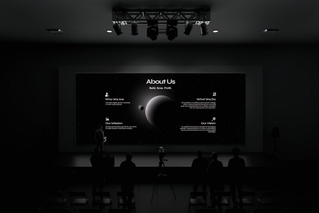
A winning pitch deck should include key components that provide a comprehensive overview of the business model, product, and market opportunity. Essential slides often include the problem statement, solution, market size, business model, competition, go-to-market strategy, financial projections, and team. By effectively communicating these elements within the structure of 10 slides, the presenter can create a compelling case for the

Conclusion

The 10/20/30 Rule for pitch decks, championed by Guy Kawasaki, is more than just a set of numbers; it’s a powerful framework for effective communication. By limiting your slides to 10, your presentation time to 20 minutes, and your font size to a minimum of 30 points, you force yourself to be concise, clear, and compelling.

I’ve witnessed countless founders transform their pitches by embracing this rule. It helps you cut through the noise, respect your audience’s time, and leave a memorable impression. So, as you prepare for your next big pitch, remember these simple yet profound guidelines. Practice, refine, and deliver your story with confidence. And if you need a pitch deck that not only follows these principles but also captivates investors with stunning visuals, the team at Lynxify can bring your vision to life. Your dream business deserves a pitch that truly shines!

Our Latest Blog Posts

10 Pitch Deck Design Ideas...

7 Pitch Deck Cover Ideas...

What is the 10/20/30 Rule...

What is the 5/5/5 Rule...

What is the 6/6/6 Rule...