Have you ever sat through a presentation where the slides were so packed with text, you felt like you were reading a book instead of listening to a speaker? Or perhaps you’ve been the one frantically trying to cram all your information onto a single slide, only to realize it’s an unreadable mess? We’ve all been there! In today’s fast-paced world, attention spans are shorter than ever, and a cluttered, text-heavy presentation can quickly lose your audience.
That’s why understanding and applying smart presentation rules is crucial. One such powerful guideline, often overlooked but incredibly effective, is the 5/5/5 Rule in PowerPoint. This simple yet profound principle can transform your presentations from overwhelming data dumps into clear, engaging, and memorable experiences. As someone who has spent countless hours crafting and reviewing presentations, I can tell you that this rule is a game-changer for clarity and impact. Let’s dive in and discover how this rule can revolutionize your approach to slide design and delivery.
Key Takeaways
The 5/5/5 Rule is a guideline for creating clear, concise, and engaging PowerPoint presentations.
It advises using a maximum of 5 words per line, 5 lines per slide, and no more than 5 text-heavy slides in a row.
Following this rule enhances audience engagement, improves information retention, and makes your presentations more professional.
While a powerful guideline, it’s flexible and can be adapted based on your audience, content, and presentation goals.
Applying the 5/5/5 Rule encourages visual storytelling and focuses on your role as the presenter, not just a slide reader.
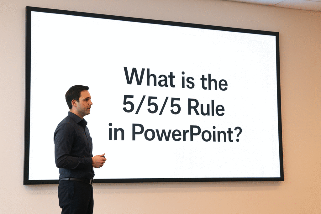
What Exactly is the 5/5/5 Rule in PowerPoint?
The 5/5/5 Rule is a straightforward guideline designed to prevent “Death by PowerPoint” – a common term for presentations that are so overloaded with text and data that they become boring and ineffective. It’s a memory aid that helps you keep your slides digestible and your audience engaged. Let’s break down each ‘5’:
The First ‘5’: No More Than 5 Words Per Line
This first ‘5’ focuses on the brevity of your text. Imagine reading a long sentence stretched across an entire slide. It’s hard to follow, isn’t it? This rule suggests that each line of text on your slide should contain a maximum of five words.
Why is this important?
Quick Scan: Our eyes can quickly scan short phrases. This allows your audience to grasp the main point instantly without getting bogged down in details.
Focus on Keywords: It forces you to distill your message down to its absolute core, using only the most important keywords or phrases.
Readability: Shorter lines are simply easier to read, especially from a distance or on a large screen. This is a fundamental aspect of good UI design – making content easy to consume.
Example: Instead of: “Our new marketing strategy will significantly increase customer engagement and brand awareness through targeted social media campaigns.” Try:
New marketing strategy
Increase customer engagement
Boost brand awareness
Targeted social media
See the difference? Each point is concise and impactful. This doesn’t mean you can’t have longer sentences in your script; it just means your slides should act as visual cues, not teleprompters.
The Second ‘5’: No More Than 5 Lines of Text Per Slide
The second ‘5’ addresses the overall density of text on a single slide. This part of the rule suggests that you should limit the number of bullet points or lines of text on any given slide to a maximum of five.
Why is this crucial?
Avoid Overwhelm: Too much text on a slide can feel overwhelming and crowded. Your audience will either try to read everything (and miss what you’re saying) or give up entirely.
Encourage Visuals: Limiting text naturally pushes you to think about how you can represent information visually. Can you use an icon, a chart, an image, or a diagram instead of words? Visuals are processed much faster by the brain than text.
Maintain Focus: With fewer points, each one gets the attention it deserves. It helps you, the presenter, stay focused on one key idea per point.
Example: Instead of a slide with 8-10 bullet points detailing every aspect of a project, break it down. If you have more than 5 key points, consider splitting them across multiple slides or grouping related ideas under broader headings.
“A well-designed slide is a visual aid, not a document.”
The Third ‘5’: No More Than 5 Text-Heavy Slides in a Row
This final ‘5’ focuses on the flow and rhythm of your entire presentation. It advises against having more than five consecutive slides that are primarily text-based. This means you should break up long stretches of bullet points with slides that feature images, videos, charts, or even just a compelling title slide.
Why is this important for your audience?
Prevent Monotony: A continuous stream of text slides can quickly become monotonous and tiring for the audience. Their eyes glaze over, and their minds wander.
Re-engage Attention: Visual breaks act like mental refreshers. A powerful image or a clear chart can re-capture attention and provide a different way for your audience to process information.
Vary the Pace: It allows you to vary the pace of your presentation. Some slides might require more explanation (where you do most of the talking), while others are purely visual and self-explanatory. This is especially vital when developing something like a pitch deck, where maintaining audience interest is paramount.
Example: If you have five slides outlining project phases with text, the sixth slide could be a large image of the team, a motivational quote, a compelling graph showing progress, or a brief video. This breaks the pattern and keeps the energy up.
Why is the 5/5/5 Rule Important for Your Presentations?
The 5/5/5 rule isn’t just about making pretty slides; it’s about making your presentations more effective. Here’s why I believe it’s a non-negotiable principle for impactful communication:
Enhances Clarity & Conciseness: By forcing you to trim the fat, the rule ensures that only the most vital information makes it onto your slides. This clarity directly translates to better audience understanding.
Improves Audience Engagement: When slides are easy on the eyes and not overwhelming, your audience is more likely to pay attention to you, the speaker, rather than getting lost in reading. This leads to a more interactive and dynamic presentation.
Boosts Information Retention: Studies show that people remember visual information far better than text. By encouraging the use of visuals and limiting text, the 5/5/5 rule helps your audience retain key messages.
Projects Professionalism: Clean, uncluttered slides look polished and professional. It shows that you respect your audience’s time and have put thought into presenting your information effectively. This contributes significantly to your overall branding and how you are perceived.
Empowers the Presenter: When your slides aren’t acting as a script, you’re free to elaborate, tell stories, and connect with your audience. The slides become a backdrop, supporting your narrative, rather than being the main event.
Applying the 5/5/5 Rule in Practice: My Top Tips
Implementing the 5/5/5 rule requires a shift in mindset, but it’s totally achievable. Here are my practical tips to help you embrace this powerful guideline:
Start with Your Core Message: Before even opening PowerPoint, write down the absolute essential message you want your audience to take away from each slide. If it’s more than a few words, rethink it.
Use Keywords, Not Sentences: For each bullet point, identify the 1-5 keywords that represent the idea. You’ll explain the rest verbally.
Embrace Visuals: This is where the magic happens! Instead of describing something with text, can you show it?
Graphs & Charts: For numbers and data.
Icons: To represent concepts quickly.
High-Quality Images: To evoke emotion or illustrate a point.
Short Videos: To explain complex processes or show real-world examples.
One Idea Per Slide (Mostly): While the rule allows up to 5 lines, sometimes it’s even better to have just one powerful idea, image, or question per slide. This can create a dramatic impact.
Practice Your Delivery: With less text on your slides, you’ll need to rely more on your spoken words. Practice your presentation thoroughly so you can confidently explain the details without reading from the screen.
Tell a Story: Structure your presentation like a story with a beginning, middle, and end. This natural flow makes it easier to vary your slides and keep your audience engaged.
Use the Notes Section: PowerPoint has a “Notes” section for each slide. This is where you can put all the detailed information, statistics, and anecdotes that you plan to say, but don’t want on the slide itself. It’s your personal teleprompter that only you can see!
When to Use (and Not Use) the 5/5/5 Rule
While the 5/5/5 rule is incredibly versatile, it’s not a rigid law that must be followed in every single scenario. Like any guideline, understanding its strengths and limitations is key.
When the 5/5/5 Rule Shines Brightest:
Sales Pitches & Business Presentations: When you need to convey key benefits and motivate action quickly. Overloaded slides are a common reason why most pitch decks fail.
Conferences & Public Speaking: Where your primary goal is to engage a large audience and inspire them.
Training & Educational Sessions (Introductory): For introducing new concepts or summarizing key points before diving into deeper detail.
Executive Summaries: When presenting to busy decision-makers who need information delivered concisely.
When You Might Flex the Rule (with Caution!):
Detailed Technical Presentations: Sometimes, highly technical or scientific presentations require more text or complex diagrams. Even then, try to make text as succinct as possible and use clear visual aids.
Handouts/Leave-Behinds: If your slides are intended to also serve as a standalone document for people to read later, they will naturally contain more information. In this case, consider creating two versions: a lean presentation version and a more detailed handout version.
Legal or Compliance Presentations: Where exact wording is critical and cannot be condensed. However, even here, visual organization and breaking up text can help.
Very Small, Informal Meetings: If you’re presenting to just a few colleagues in a very informal setting, you might be able to be slightly more flexible, though conciseness is always a good idea.
Even when you flex the rule, the core principle of clarity and avoiding overwhelming your audience should remain your guiding star. Always ask yourself: “Is this slide easy to understand at a glance?”
Beyond 5/5/5: Other Presentation Tips for Success
While the 5/5/5 rule is a fantastic starting point, remember that effective presentations involve more than just slide design. Here are a few other tips I always keep in mind:
Know Your Audience: Tailor your content, language, and examples to whom you’re speaking to. What do they care about? What problems can you solve for them?
The 10/20/30 Rule: Another famous guideline, especially for pitches: 10 slides, 20 minutes, 30-point font. While different from 5/5/5, it shares the same spirit of brevity and impact.
High-Quality Visuals: Pixelated images or unprofessional graphics can detract from your message. Invest in good stock photos or design elements.
Consistent Design: Use a consistent color scheme, fonts, and layout across all your slides. This creates a professional and cohesive look.
Practice, Practice, Practice: Rehearse your presentation multiple times. Know your material inside and out so you can deliver it smoothly and confidently. This builds confidence and helps you adapt to unexpected questions.
Engage with Questions: Encourage questions and interaction. A presentation is a two-way street.
Strong Opening and Closing: Grab attention from the start and leave a lasting impression at the end. Your conclusion should summarize your key message and include a clear call to action if applicable.
Common Mistakes to Avoid When Using the 5/5/5 Rule
Even with a good rule, it’s easy to fall into traps. Here are some common mistakes I’ve seen people make when trying to apply the 5/5/5 rule, and how to avoid them:
Treating it as a Strict Law: Remember, it’s a guideline. Don’t sacrifice clarity for rigid adherence. If a point truly needs six words, don’t force it to five if it makes less sense.
Shrinking Font Size to Fit More: This completely defeats the purpose! If you’re having to make your font tiny to fit within the 5/5/5 limits, it means you have too much content. Split it onto another slide or cut something.
Over-Reliance on Icons Without Context: While icons are great, make sure they are universally understood or briefly explained if ambiguous. An icon alone might not always convey the full meaning.
Ignoring the “5 Text-Heavy Slides” Rule: This is often the hardest one to follow. People get into a rhythm of bullet points and forget to break it up. Be intentional about injecting visual slides.
Thinking “Less Text” Means “Less Content”: It means less on the slide, not less in your presentation. All the details you’ve removed from the slide should be elaborated on by you, the speaker.
FAQs
What is the 5/5/5 Rule in PowerPoint?
The 5/5/5 Rule in PowerPoint is a guideline designed to help presenters create visually appealing and effective presentations. According to this rule, each PowerPoint presentation should contain no more than 5 lines of text per slide, with each line consisting of no more than 5 words. This results in a maximum of 5 words per line, promoting conciseness and clarity, allowing the audience to focus on the main messages rather than being overwhelmed by text-heavy slides.
Why is the 5/5/5 Rule important?
The 5/5/5 Rule is important because it helps to prevent information overload, which can occur when too much text is presented on a single slide. By adhering to this simple rule, presenters can ensure that their PowerPoint slides are not only visually appealing but also effective in conveying key points. Moreover, it encourages presenters to think critically about what information is essential, ultimately leading to a more engaging and impactful PowerPoint presentation.
How can I apply the 5/5/5 Rule in my next presentation?
To apply the 5/5/5 Rule in your next presentation, start by reviewing the content you wish to include. Aim to distill your key points down to a maximum of 5 lines of text per slide, ensuring that each line contains no more than 5 words. This may involve summarizing complex ideas into simple phrases or using visual aids, such as images and graphs, to complement your message. By doing so, you will keep your audience engaged and enhance the overall effectiveness of your PowerPoint presentation.
Conclusion
The 5/5/5 Rule in PowerPoint is more than just a design guideline; it’s a philosophy for effective communication. By embracing brevity, prioritizing visuals, and breaking up text-heavy sections, you empower your audience to absorb your message, stay engaged, and truly remember what you’ve shared.
I encourage you to apply this rule to your next presentation. You’ll likely find that it not only makes your slides clearer and more professional but also forces you to become a more articulate and engaging speaker. Say goodbye to “Death by PowerPoint” and hello to presentations that truly shine! And if you need expert help crafting a visually compelling, investor-ready pitch deck, Lynxify is here to turn your ideas into a powerful presentation that gets results. Your audience (and your message) will thank you for it.